A case study
Airbnb:
Improving Search & Filters
Challenge
The challenge was to gain insights into how users interact with Airbnb's search and filtering features when booking holiday accommodations. The goal was to uncover potential usability issues, understand user preferences, and identify areas for improvement in the interface to enhance the overall user experience.
Disclaimer: This project was completed as a student assignment at Noroff and is not connected to or officially endorsed by Airbnb.
My role: UX-designer and researcher
Timeline: 1 week
Result
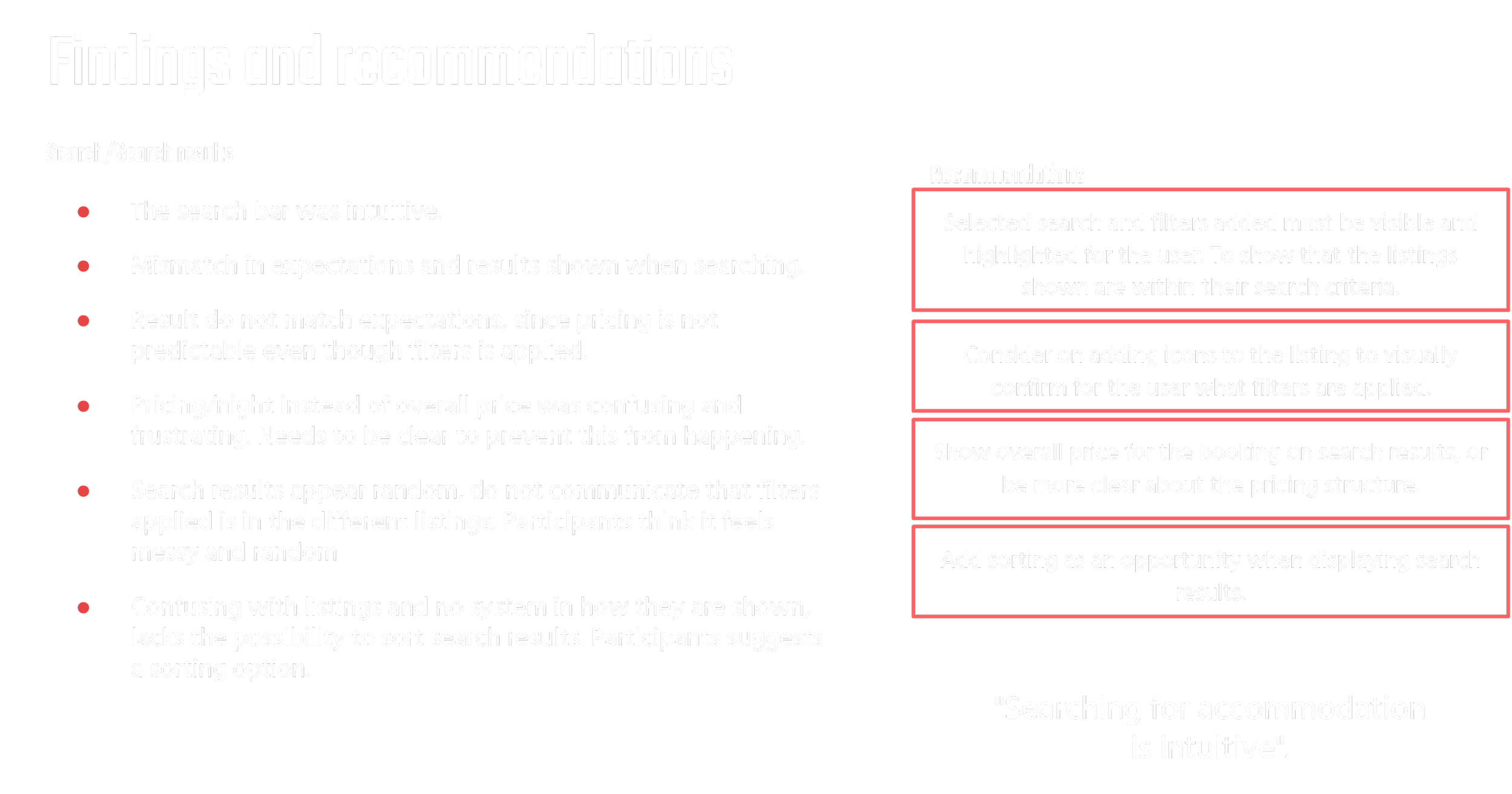
The usability testing revealed several issues, including inconsistent search results, confusing filter categories, and unclear pricing information.
Users expressed frustration with the search and filtering process, leading to key recommendations for improving clarity, usability, and overall user satisfaction on the Airbnb platform.
Process and methodology
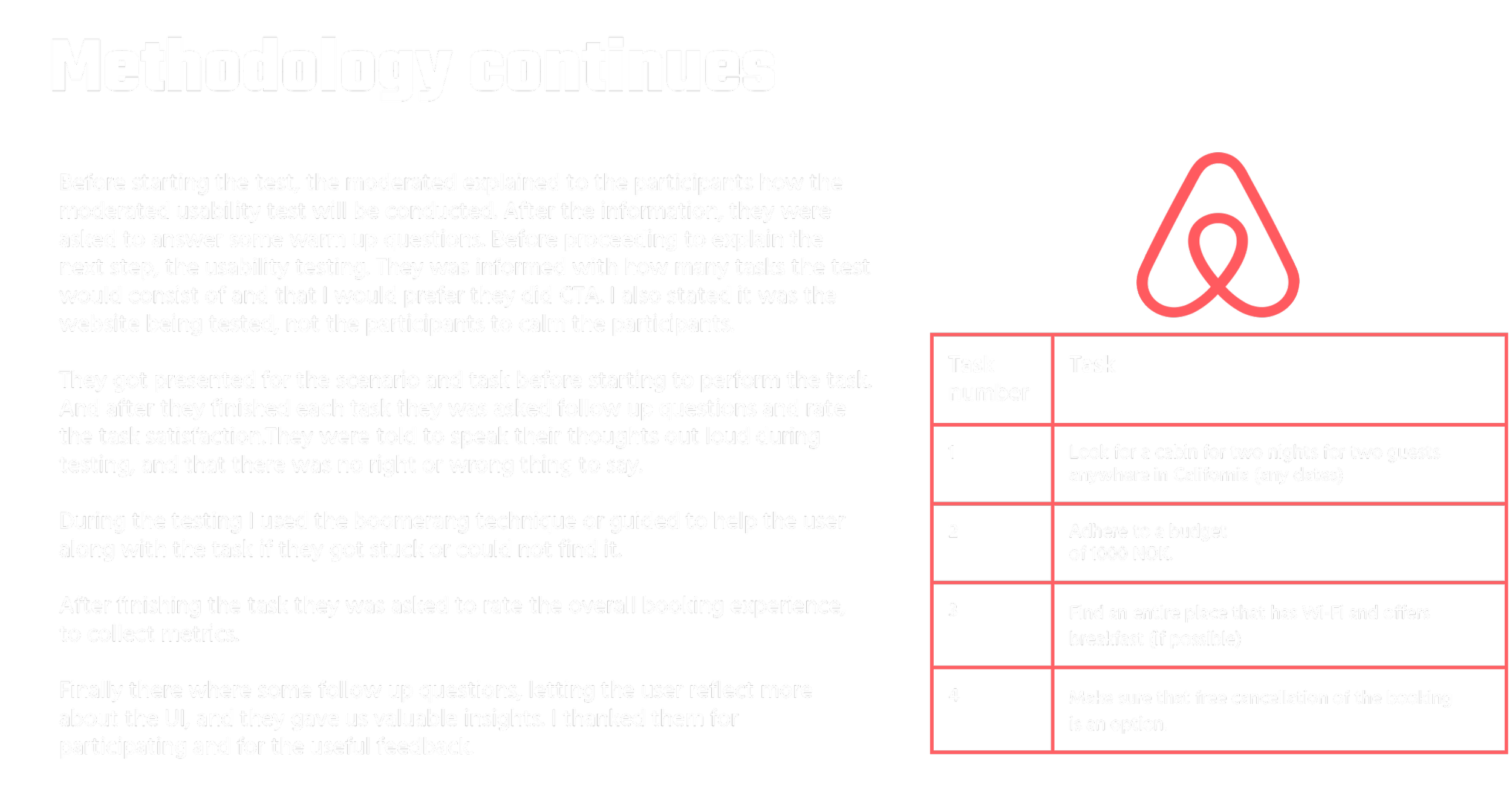
Participants: 3 users
Testing Method: Moderated remote sessions with a think-aloud approach.
Key Tasks:
Search for a cabin in California.
Apply a budget filter of 1000 NOK.
Find accommodations with Wi-Fi and breakfast.
Ensure free cancellation is an option.
Focus areas
Overall satisfaction
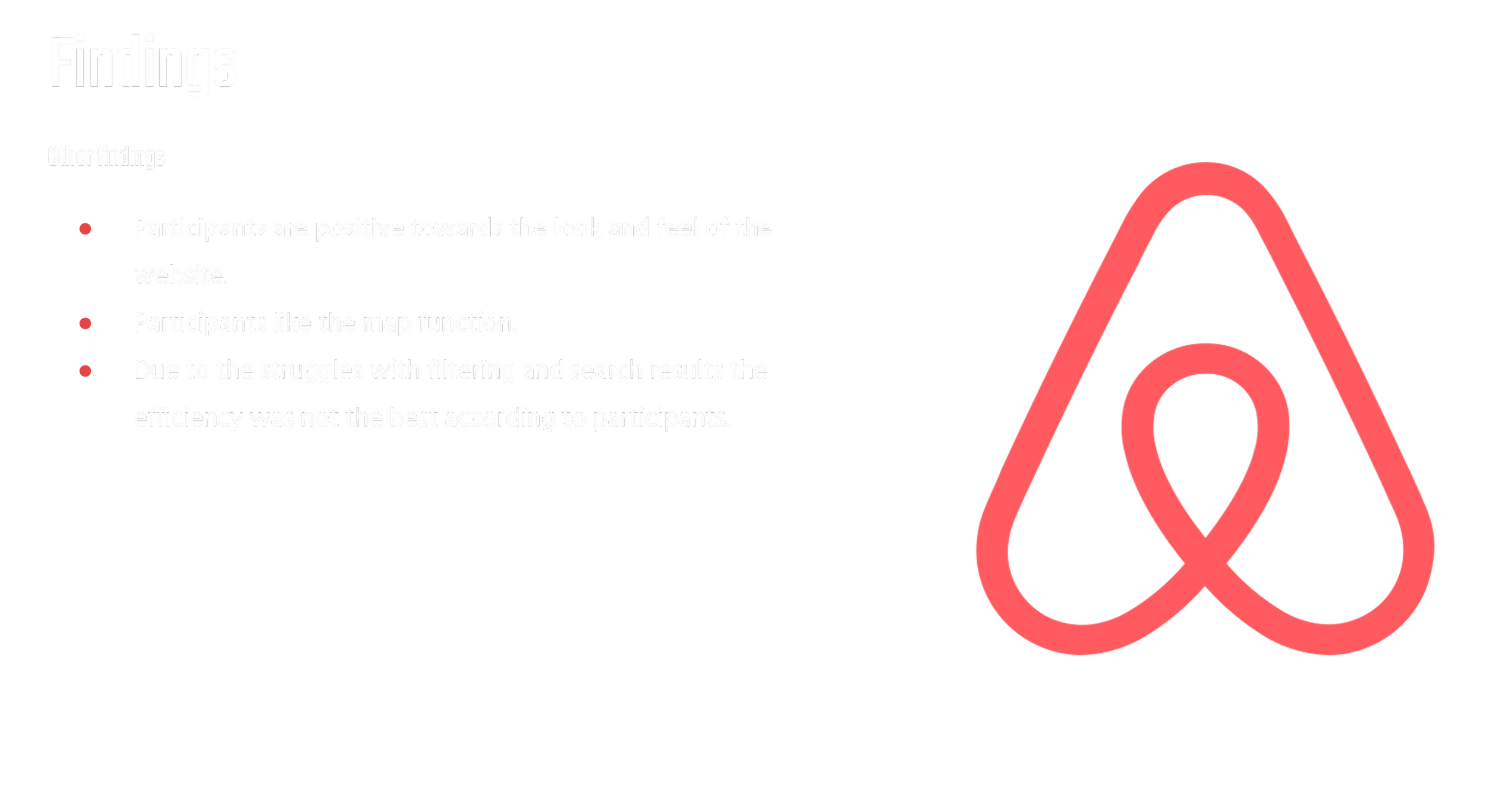
Positive feedback on the site’s look and feel, but users expressed frustration with filtering and search results.
Task satisfaction
Search for a cabin in California.
Apply a budget filter of 1000 NOK.
Find accommodations with Wi-Fi and breakfast.
Ensure free cancellation is an option.
These results indicates that there are usability issues in some of the areas related to task 2-4. It relates to search and filters and UI.
"Surprised it was so difficult to find right filters, even though I have used Airbnb several times before."
Usability test insights: Key findings and design enhancements
Iterations based on findings
This is an alternative to the filter solution. That should be considered user tested, and compared to the suggestion proposed on the iterations.
This filter solution provides the user with easy access to the filter, and is an option that might make the user journey smoother.
Proposed filter solution
Summary of findings and recommendations
The usability testing provided valuable insights into the search, filtering, and overall user interface of the website. Observing participants confirmed our hypothesis that users face challenges in navigating search and filtering features. The testing highlighted key areas for improvement, particularly in search result clarity, pricing transparency, and filtering efficiency.
Participants expressed frustration with the current filtering process, finding it cumbersome and confusing. The gap between applied filters and displayed results was evident, and the icon bar needs revision to reduce confusion. Despite these issues, the website's overall look and feel received positive feedback, making it crucial to retain the brand's identity.
For future development, I recommend a detailed review and reorganization of the filter section, including card sorting to align with users' mental models. Additionally, testing the inclusion of icons in filter categories could improve usability and better communicate available amenities. Once these iterations are complete, a follow-up usability test should be conducted to ensure the changes meet user expectations and enhance the overall experience.


